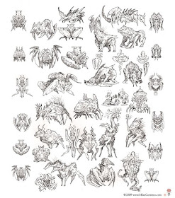
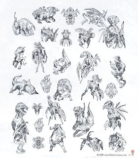
 When you hit a creative block, throw all plausibility and functionality out the window. At this point you can drop all the rules and limitations of reality and push more toward the strange, abstract and completely random ideas that are more aesthetically pleasing or iconic and graphically designed in shape. Tiny doodles that almost appear as stick figures or jellyfish can be turned into something more plausible and functional at a later point in time. I find that cropping portions of these quick sketches, duplicating them, flipping horizontally/Vertically and mirroring the image can sometimes quickly spark ideas to use as a base point for a more detailed concept.
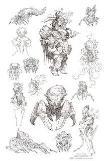
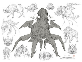
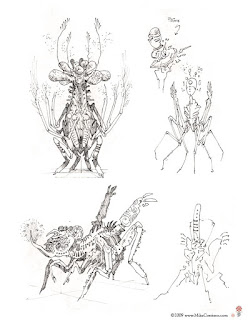 As artists our minds constantly work overtime (which is why it's generally common that artists have trouble sleeping or develop Insomnia as a result); Our minds are never at rest. We wonder then why it is that we stare at a blank piece of paper incapable of coming up with even one good idea. This is just a normal reaction to an overabundance of thoughts; in essence it's the same as bursting a metaphorical bubble, in this case it's our creative bubble that bursts leaving our minds blank. Surround yourself with your own work and other artists works. Pin some of your favorite imagery up on walls. As you're drawing it will generally help to keep things simple and loose while trying to overcome that creative block. Try creating a few variations of one similar idea, leaving each new sketch on the screen or on the same canvas or sketchbook page for reference and inspiration. This way you immediately skip past the trouble of coming up with something completely new and you can work with what you've already produced, letting those doodles and sketches continue to evolve and develop.
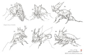 First and foremost, never try to force a drawing if you're coming up with blanks and expecting some profound concept to just burst out of thin air. The more you force it, you're more likely to become frustrated and feel like giving up. This usually results in some of the most uninspired and generic designs.
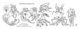 Never stare at a blank piece of paper. Don't assume that you're going to see a great design floating around in your mind and you'll easily be capable of translating that down on paper. Most artists may have thousands of ideas pass through their subconscious on any given day. My suggestion is to get up and walk away from the sketchbook or the computer. Go for a walk, listen to music, read a book, watch a movie, play a video game or check out other artists works on Art Forums. It doesn't hurt to take a 10 minute break or even an hour or two. Below are a few good art forums worth checking out:
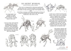 Another simple solution is to use a topic generator. One of which was made very popular by artists Hydropix, Vyle, Viag, Sparth and Barontieri called 3CH. You can download the 3CH topic generator here: http://3ch.redwhirlpool.com/3CH/3CHMODS.zip You'll see a few sample topics below.
- A gigantic golem embraces a woman in a desert.
- An ectoplasmic scorpion flees a sentinel in a landscape of bubbles.
- A dark shaman bombs a carnivorous plant in the abyssals zone.
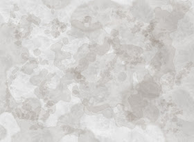
If you've ever stared into the sky and seen images in clouds that don't really exist the same principal goes for staring at patterns in decorated rugs or photo textures - Mayang Texture Library - of things like mossy grass or dry cracked dirt. We're capable of seeing "something" more than most other people because we can 'connect the dots' so to speak. We can more quickly identify what appears to be an eye, mouth, nose, a body of an animal or a cartoon character and other similar imagery. All we need is a vague starting point in order to begin the creative process. So why do we stare at a blank white page? By taking this same idea and incorporating it into your sketchbook or your digital canvas, it will help to get the creative juices of your mind flowing. You can see some samples below that use what I like to call "Cloud Lines" or photo textures which you can use in order to get past that white page. Anything to break up the blank white space will help.
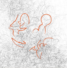
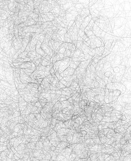
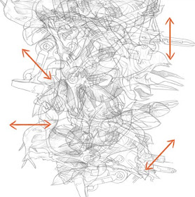 Draw a bunch of very light scribbles, doodles and random fluid or geometric shapes. If you're doing this digitally, you can just continuously duplicate, free-transform and paste these scribbles and shapes all over a canvas as a starting point. Aside from this Cloud-Like effect as a base point to start with, you could either use a photo texture and just obscure the imagery, pattern or what have you, and then lower the opacity, flip and rotate or modify the original content so it no longer becomes recognizable.
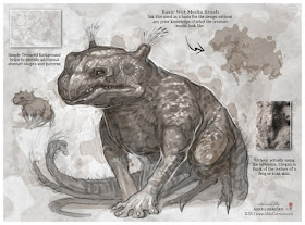

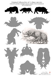
 Simplicity is key. In using a simple silhouette of an inanimate object, or merely drawing a simple oblong shape you can give yourself a challenge or a little puzzle to exercise your brain and your imagination. Take this oblong shape and try to determine what could be a head, where the main torso is, what can you add to it at this point to continue the process? In the process of trying to create a living creature out of a random unplanned shape you've already overcome the dreaded blank page and creative block that causes so much frustration among artists.
 Where are you more likely to be inspired; In a stark blank white room with no doors or windows? Or out in the open at a zoo or park surrounded by animals, people, vegetation, colors, life, noise and motion? Perhaps take your sketchbook outdoors rather than inside a quiet room you've become used to. You can find inspiration by talking to people, reading a good book, heading out to the park for a walk or a jog, interacting with life, observing indigenous animals, how light affects the color of leaves, plants, flowers and trees. The way shadows fall on surface textures of bricks, cracked stone, pebbles and bark. Expose yourself to new surroundings.
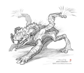
 Abstraction, Subtraction, Addition & Imagination; It's better to sketch anything at all over just waiting for ideas to pop in your head while staring at a white sheet of paper.
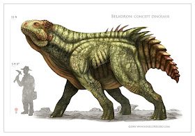
If you still find it intolerable and frustrating to come up with anything at all; When in doubt just do some research and studies. It's important to draw studies of human or animal anatomy to begin with, so it may help to drag 3 or 4 photos of various animals on to your screen and observe their anatomy. A little exercise that comes in handy is to draw two animals with reference and then a third animal or "creature" based off of what you just learned from the two studies you produced. It works best if you draw two animals from completely different "Classes" in the Animal Kingdom IE; A water buffalo - Class: Mammal & an Anole - Class: Reptile. In this specific design I used anatomy of Iguana, Cattle, Water Buffalo etc.
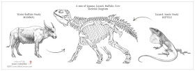
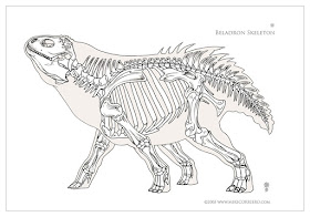 I'll touch more upon the Animal Kingdom, on mixing and matching various animal anatomy and how important it is to use reference, to research and read, study and observe and understand the biology of these studies rather than just trying to re-draw line for line what you're looking at in a photo. (We'll get to that next time). A few other subjects for future topics will include body structures, line weight, use of color, skin texture & patterns, thumbnails, Sketch to Final Color, symmetrical & asymmetrical designs, Focal Points, Use of Silhouettes etc..
Guest blogger Mike Corriero is a character, creature, and conceptual designer and illustrator living in New Jersey. Since graduating from Pratt Institute in 2003, Mike's client list has included Breakaway Games, Fantasy Flight Games, Allied Studios, Kingsisle Entertainment, Radical entertainment/ Vivendi Universal Games, Liquid Development, Zynga Inc, Challenge Games, Paizo Publishing and Hasbro Inc, among others. Mike's book "PLANET to PLANET creatures and strange worlds" includes hundreds of his sketches of creatures, robots, alien life forms and their environments. I recommend it for students focusing on visual development for games, or anyone who loves creature design. - J. G. O.


