Tuesday, November 30, 2010

Free Color Scheme Designer

Confounded and confused about complementary colors? Looking for a bit of color inspiration? Fret not, the Color Scheme Designer is here! http://colorschemedesigner.com/

Just drag around the small dot on the color chart. You can choose different models for your color scheme.

The Mono or Monochromatic Model is based on a single color tint and uses only variations made by changing its saturation or brightness.
The Complementary Model is where the primary color is supplemented with its complement which is the color that can be found on the opposite of the color wheel.
The Analogic Model is made by the primary color and its adjacent colors found on the color wheel – two colors identically on both sides. This color scheme always looks elegant and clear which gives a warm approach.
The Accented Analogic Model. This is the Analogic model with complementary (contrast) color added.


 The Tetrad or Double-Contrast Model is a scheme is made by a pair of colors and their complements. It is based on the foursome of colors evenly distributed on the color wheel (90 degrees distribution) – also known as the Tetrad.


The Triad or Soft Contrast Model gives you an effect where the primary color is supplemented with two colors that are placed identically on both sides of its complement.


Play around with colors by adjusting the Schemes and hues for different models. There's even a randomized pallete. You can choose RGB, web colors, Pantone colors or RAL colors that you can sample and use in Photoshop. You can also view a light page example or a dark page example.

Now if you are serious about taking a crash course in color (and light), then head on over to Dinotopia creator James Gurney's celebrated blog Gurney Journey to read his various entries on color here. Or better yet, purchase a copy of his newest book on the topic; Color and Light. Just a few samples are posted below. Five stars; I can't recommend this book highly enough!


Sunday, November 28, 2010

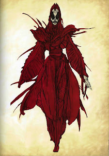
Iain McCaig

Award winning and Internationally recognized character designer, concept artist, illustrator, screenwriter, producer, author and art instructor Iain McCaig is a busy man to say the least. His concept work,  character design and storyboarding skills are highly sought after within the film community, where he has contributed  to such high profile projects as the Star Wars prequels, Terminator IIHook, Francis Ford Coppola's Dracula, Interview with a Vampire, Peter Pan (2003), and Harry Potter and the Goblet of Fire. He is also Co-Producer and concept design Director of Ascendant Pictures science fiction epic Outlander.

McCaig's screenwriting credits include his adaptation of Ursula K. Le Guin's A Wizard of Earthsea for ShadowCatcher Entertainment and was co-author of People, an Emmy nominated animated special created for the Disney Channel. He also wrote and designed The Pied Piper for Imax/ Mainframe and made his directorial debut with the award winning film The Face in 2000.

Iain McCaig co-founded Ninth Ray Studios LLC in 2005,  a freelance story and design group which has provided pre-production and development for several feature films including Outlander and both the Paramount and Disney/ Pixar versions of John Carter of Mars.


The images here are taken from his highly recommended art book "Shadowline: The Art of Iain McCaig", which is both a fictionalized story of a visit to an otherworldly studio and an intensive drawing course (I'd grab one while you still can)! McCaig's website is infamous for possibly being the longest "coming soon" website in history, but in the meantime he has started an inspiring blog which will hopefully continue well into the future. McCaig is also has four bestselling instructional DVDs available through the Gnomon Workshop.

Friday, November 26, 2010

Brittney Lee

Designer, Illustrator and Animator Brittney Lee creates the kind of charming and effervescent characters that can leap to life in a very wide variety of applications; from traditional animation, CG animation, book and stationary illustration to stunning fine art cut paper sculptures. Lee's design, draftsmanship and color acumen are particularly evident when her characters are found inhabiting an environment that she has created especially for them. Tendrils of hair play off gracefully winding vines, cascades of water dance around lush curvilinear vegetation, warm sunlight bathes elegant Parisian courtyards. Despite the skillful simplicity her design, the viewer is tempted to linger, not wishing to leave Lee's enchanting worlds too soon.


You can witness Brittney Lee's amazing five year artistic evolution on her blog. I expect that we'll be seeing many more delightful characters and visions from this young artist in the coming years, and I'm looking forward to seeing where she takes us next!

Wednesday, November 24, 2010

How to Kill a Great Character Design, Part Two: Sawtoothing, Tangents and lack of Variance

Here are a few more common drawing pitfalls to avoid in most circumstances.

Sawtoothing refers to unnatural clumps of hair or feathers that often resemble the teeth of a saw blade, or are simply painfully monotonous shapes within a design that wasn't structured for such. Vary the lengths, size and volumes of locks of hair, along with their direction, to create soft, natural and visually pleasing hair or fur.


Tangents happen when one shape lines up (tangents) with another, fooling the eye into seeing unintended shapes and making it difficult to differentiate separate forms. Disney veteran Philo Barnhart shares a few "tangents I have known" from "The Little Mermaid":


Lack of Shape Variance Like sawtoothing, this can occur in monotonous, repeating folds of fabric, wrinkles or folds of flesh, markings on animals, feathers, tatters on clothing and other details.


Success! This gryphon character design "Varick" by Anya McNaughton has it all; varied hair/ lack of sawtoothing, shape variance in the feathers, toes, interior hair groupings, markings, and more, along with a careful avoidance of tangents:


When to Break (some of) The Rules When creating a flat, graphic character design or a character that uses pattern as part of it's design or texture. Examples include Aurora's repeating hair shapes, which fit in with Eyvind Earle's stylized art direction of "Sleeping Beauty".


The clean, simple character designs for "The Secret of Kells" who employ some shape consistancy to blend in with their world of repeating patterns that mimic some of the themes of Celtic illumination.


Character Designer Cory Loftis' "Girl Wizard"; while maintaining many of the rules of good design, pattern is used on her clothing, with repeating shapes echoing the look on the owl companion. Consistency is key when purposely using patterns and repeating lines or shapes.


The same element of consistency applies to Nico Marlet's designs,


More of these tips can be found in a PDF download here. The PDF is an interpretation of some handwritten notes to my clean up team on "The Rescuers Down Under" 20+ years ago. The original notes have been xeroxed so many times since then that they are barely legible. I will try to re-write them one of these days!

Monday, November 22, 2010

How to Kill a Great Character Design, Part One: Twinning and Parallels

There are some basic design "rules" for drawing characters for animation, and some of them have already been discussed here . These rules can also apply to other types of drawing, such as figure studies, illustration, portraits and the like. I put "rules" in quotes because they have some flexibility and can be broken on occasion in various circumstances. But if a student of character design is in the early stages of developing his or her portfolio, it is best to keep all of these rules in mind while doing so. Avoiding these character killers early on can lead to successful drawing habits in the long term!

Twinning and Parallels
We've all seen them; stiff, lifeless poses that seem more wooden and flat than Egyptian hieroglyphics. Two factors that often contribute to this are the employment of Twinning and/ or Parallels in the pose. Frank Thomas and Ollie Johnson demonstrated the killing effect of twinning in their classic animation manual "The Illusion of Life":


Does this mean that symmetry is always a bad thing? Certainly not! But when creating a character for almost any application variance within an otherwise symmetrical design is what creates a natural and visually engaging figure. Take this illustration, titled "Ancient Bloodlines" by the award winning fantasy illustrator Dan Dos Santos. On the left is the original illustration, on the right we see two halves of the illustration "twinned" with one another. Click on the image to enlarge it and look at each, one at a time, and notice the variations on each side of the original painting; from the number of feathers in her headdress to the use of shadow and finger positions. The cumulative effect of all these variations is a character that feels more natural, alive and engaging than the twinned version. Note also how many vertical, horizontal and diagonals can be found within this composition, all given to us by the costume design and finger positions (none of the fingers are paralleled). These keep the eye moving and engaged:


Similarly, another way of enlivening an otherwise static poses is to cut into the strong vertical or horizontals with diagonals that are added using drapery, props, long hair, or background elements, as is seen in the image by the Art Deco master Erté on the right, and the image of the knight on the left (I'm still searching for the illustrator of this one; if you know who they are please email me so that I can credit them)! Erté defined Art Deco "as a fusion of the curvilinear designs of Art Nouveau of the 19th Century with the Cubist, Constructivist, and geometrical designs of modernity." In other words; a well balanced use of straights against curves.


Symmetry is often used when creating turnaround drawings for model sheets, particularly for television animation (see the sample of Nightwing by Greg Murakami, below). The pose is indeed stiff and wooden, but it serves it's purpose as a clear schematic for animators and assistants. Feature Film artists tend to use far more varied poses for their turnaround model sheets:


Parallels are similar to twinning, but aren't a near mirror image of what is happening with the other side of the figure. They occur when body parts or props inadvertently parallel one another in an otherwise natural pose, as is seen here in this character design by Jason Adams. An otherwise winning pose is thwarted by the parallels created by the arm and leg of the left hand side of the figure (Figure A.) Altering either would remedy this, or even resorting to something closer to a classic fencing pose which can still feel stiff with tension and formality, but avoiding the trap of parallels still keeps it somewhat natural (Figure B.):


If showcasing just one example of of a character design, a 3/4 view is generally your best option (see the darkened figure in the Nightwing model sheet). A 3/4 view doesn't offer many opportunities for twinning and it also conveys a greater sense of dimension that a front or side view, particularly if you're presenting a line drawing without adding shadows. Add natural body and head tilts, variations in the limbs, fingers, and folds in the fabric, solid structure and anatomy and an engaging expression, and you'll have created a character with that elusive quality called "appeal":


                                           Puss in Boots by Sandro Cleuzo


Wednesday, November 10, 2010

Hand Reference, Part Three

The first set comes to us from the 1999 Warner Brothers film "The Iron Giant" and belonged to the lead character, a young boy named Hogarth, though I feel that they would work for a stylized male character of almost any age. The second set of sheets come from the soon to be released Disney animated Feature film "Tangled" and were created by the celebrated Disney animator Glen Keane. Remember that portfolio reviewers will almost always look for how you handle the faces, hands and feet of your characters, as avoiding any of those three areas sends up a warning flag about an artist's overall competence as a draftsman.