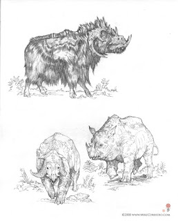
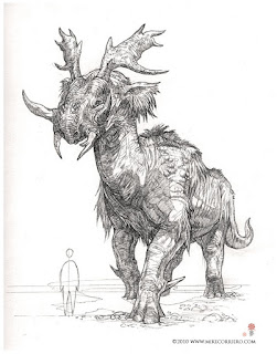
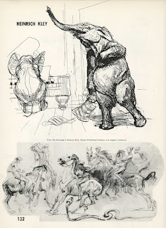
 Jerad studied illustration with a minor in entertainment design at the Pasadena Art Center College of Design, graduating in 2005 (at the time the entertainment department was still being formed and entertainment design was not available as a major). Prior to college, Jerad only started to really study creature design at the age of 13 taking an interest in creature sculpture, figure drawing and character design at a school in Sherman Oaks California called Associates in Art where he was taught by industry professionals. He also attended the Los Angeles County High school of the Arts in East LA. During which time he had taken an internship at a local special FX House. While attending the local FX House, he learned everything from sculpting to mold making.
 Jerad S. Marantz is currently lead artist at the Aaron Sims Company. He also freelances for many FX houses like Tinsley Studios, Legacy FX / Stan Winston’s, Amalgamated Dynamics Inc., and Quantum Creations. He also works directly for Universal from time to time. In addition to film, Jerad also spends a lot of time producing work for the video game industry. He has worked for such companies as Ncsoft, Sony, THQ, Midway, Respawn and Konomi. One of his most recent jobs was designing the creatures for Infamous 2.
 Most of his latest jobs have been on big budget films; to name a few: Spiderman (2012), Transformers 3, X-Men First Class, Ghost Rider: Spirit of vengeance, Sucker Punch, and Green Lantern.
 JSM: My Favorite past projects are Clash of the Titans and The Burrowers. Clash of the Titans was an amazing project and I loved designing for Louis Leterrier. This was also the first big budget film I worked on where I could really see my designs come through. The Burrowers was a great project even though it ended up being a direct to DVD flick. I really like the tone of that film and the creature was a blast to design.
 I design using a wide range of techniques. I feel that being able to switch up the way you work makes the process consistently interesting and it keeps me on my toes when I’m working an eighteen hour day. I’ll draw, paint in Photoshop, integrate photos in paintings, just photo-bash, model in Zbrush, or sculpt in clay. Unfortunately I haven’t sculpted in clay for years, but do miss it. I find that with programs like Zbrush the results come much faster and require no set up or cleanup. As a designer the more portable you are the better. I used to need a scanner for my drawings, but now I’ll draw directly in Photoshop. It’s just more efficient and speed is a big factor in design.


MC: How important is it to study human and animal anatomy both from life as well as photos when it comes time to designing a fictional creature? Do you often visit zoos or local museums, life drawing sessions and or draw anatomy studies from books and reference material online?
JSM: Studying anatomy is insanely important. I’ve been studying it for years. I got my first anatomy book when I was around 12, and it was called “An Atlas of Anatomy for Artists” by Fritz Schneider. After that I moved on to my favorite anatomy book, which is “Animal Anatomy for Artists” by Eliot Goldfinger. I highly recommend that book, as well as “An Atlas of Human Anatomy”, also by Goldfinger.
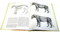 I prefer these books to anything else because of their accurate portrayal of anatomy. With many anatomy books, the artists who illustrate them tend to over exaggerate and bulk out the muscle groups. Muscles are thick overlapping sheets, essentially, and to draw them any other way is inaccurate, especially when you keep in mind that there is skin over these muscles. In my studio I tend to surround myself with a lot of anatomy charts, mainly human. There isn’t a lot of difference among mammals. All mammals have the same basic structure, proportioned differently, but with very similar skeletons and muscle groups.
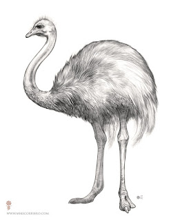
 When I first started seriously studying art, I went straight into figure drawing. I’ve been figure drawing for years. It was something that I knew I should be disciplined in, but I would never refer to myself as an accomplished figure drawer. For some reason I don’t have the patience to draw things directly in front of me, so I’ve never drawn at a zoo. I tend to be more efficient at drawing directly out of my head, but without studying, without years of observation, drawing out of one’s head would be completely pointless. Everything I do is grounded. When I start an assignment, I’ll actually create collages of reference so that I know I’m pulling from reality. I actually assign the reference collages in my creature design classes. Reference is essential in creating convincing creatures.
MC: When working on a long term freelance contract or working on a project that demands a large array of variants and ideation's of multiple creatures and characters; Do you feel that it is to your benefit to work digitally over traditionally? Would you tell students that it is essential to learn at least 1 or 2 digital painting programs if they choose to pursue a career in the concept art and entertainment industry?
JSM: It is imperative now more than ever that an entertainment designer knows more than one program. It’s not enough to know Photoshop, you really need to know a 3D program as well. The level of finish that’s required of designers today is higher than it’s ever been. I’m often required to create images that look like stills from the potential film. In order to accomplish this I’ll end up doing a few sketches at first. Once a direction is resolved, I’ll start modeling it in Zbrush and then I’ll bring it into Photoshop to finish. Zbrush is a great program for a creature or character designer to know. When it comes to more illustrative assignments, I’ll actually use Google Sketchup to block in a composition so that the perspective is already resolved and I can just focus on designing. Working with 3D is also important because once a direction is committed to and the initial render is done, it becomes very efficient to just do variations over that render in Photoshop. For example, when I was working on the Kraken for “Clash if the Titans,” we would start with a base model, and basically just paint over it in Photoshop using different sea creatures and photo textures to come up with multiple variations so that the director could pick and choose. Ideally, if you’re working with a director who can do this, they will kind of mix and match elements from the many variations and combine them to construct their particular vision.

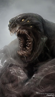
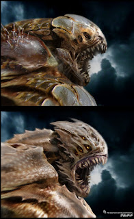


MC: If you've ever hit a creative block or felt that the beginning phase of designs on a project are becoming stiff and uninspired, what do you usually do to clear your head and begin with a fresh frame of thought? Can you offer any tips to overcoming the overwhelming feeling of restrictions or limitations that cause a creative block?
JSM: I very rarely hit creative blocks. Imagination is a muscle, and like any other part of your body, you can exercise it. I find that I tend to do exercises in my head all the time, whether I’m working or not. I’m always curious and I’m always, for some reason, thinking about creatures and trying to create new designs. That being said, there are several ways to get out of a creative block. I find that by having many ways in which to work, multiple methods in which to design, one rarely comes across a mental block.
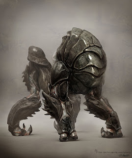 There are also different ways of thinking about creature design. Aside from combining animals that already exist, you can think in terms of just basic shapes—triangles, squares, circles. All of these basic shapes have a different emotional reads and when you try to design within shapes, it frees you up to explore fascinating silhouettes. Of course you need an in-depth understanding of anatomy to eventually make sense of those silhouettes and shapes, but changing the way that you approach the design can often free you from a creative block.
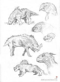
 Oftentimes when I’m working I have to work on multiple shows at once. So I find that if I simply write one-sentence descriptions of the variations of the creature that I want to do, all of the imagination part is pretty much over and I just have to execute it. If I had to do a werewolf creature, and I have to do five options, I would literally start writing five short phrases, one per design. For example: werewolf/racing dog. Instantly, what would come to mind is a wolf with the physique of a racing dog—very slender and fast. A good creature designer will instantly be able to visualize that potential design and execute it. I’ll continue: I’ll write bat/werewolf. Instantly you can imagine combining elements of a bat with a werewolf, and again there’s a new design. Armadillo/werewolf, rhino/werewolf… it just goes on like that, and it simply becomes a matter of executing the points on the list.
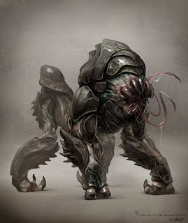
MC: I notice you start a lot of your designs in traditional pencil or pens, providing multiple variations in a traditional format before moving on to rendering in digital programs. What do you feel is the difference and or advantage between the two mediums?
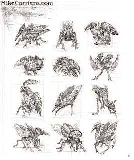
JSM: I like to start my designs in pencil. I can design a creature in a half hour, just simply with line work, and there is nothing faster. The biggest problem with working in pencil is that it’s simply not enough. It doesn’t answer enough questions, especially textures and color. Many directors and producers struggle with reading drawings, and have come to expect designs that look photo real.
 When I jump on a project, I like to deliver my first set of designs in a way that really helps me understand what the director can interpret. I’ll include line drawings, grayscale tone work done in Photoshop, and also very realized designs done either in Zbrush or that have a very heavy photo base in Photoshop. Working this way, I can tell what the director responds to. While I was working on “Clash of the Titans”, the design process was a very efficient because Louis Letterier could read everything from a fairly tight drawing to a napkin doodle. Drawing is an imperative skill.


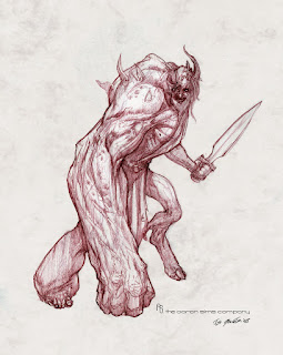

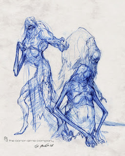
MC: To provide students with a basis on the fundamentals of creature design, what are a few of the most important things they need to study, understand and consider when approaching the most basic elements of conceptual monsters? Where should they start?
JSM: The first thing that students need to have is a solid understanding of anatomy, both human and animal. I teach at two different schools, the Concept Design Academy in Pasadena and Gnomon School of Visual Effects over in West Hollywood. I’ve been teaching now for four years and I’ve noticed that most students lack a basic understanding of anatomy. Second, I would encourage students to also study evolution.


MC: It's easy for artist to fall into a generic sense of design, usually just redrawing portions of photos. What would you suggest they do in order to stray as far outside the box as possible, so as to come up with unique and plausible creatures.
JSM: It’s very easy to start repeating yourself as a creature designer. Often times what keeps me from it are just the many different assignments I take on. It’s crucial that you study your own work. It makes you aware of the patterns you fall into. I look at my work from time to time and I see the patterns. For awhile I was obsessed with backward legs. And in 2006, all I would design were creatures with large neck muscles that made the silhouette look like a hood. It’s important that you study your own work and you identify your patterns, so that you can break them. There is of course something to be said for style; there are a lot of creature designers who identify themselves with a certain style, but in my opinion, style contradicts entertainment design. You do not want your book to have a heavy style at all. Having a heavy style will limit the work you take on. Ideally you want to convince a potential client that you can take on anything he throws at you, whether the creature is nightmarish or adorable.


MC: Who are some creature and character artist you look at for inspiration? How has their work and their sense of design influenced you and your own work?
JSM: There are a lot of creature designers out there that have really influenced me. To name a few: Miles Teves, his work feels very natural to me. Aaron Sims had a profound influence over my work. His level of finish just fascinated me and it was something I wanted to be able to accomplish myself, which is of course why I now work with him. Another one of my favorite creature designers is Nirasawa. His Creature Core and Nira Works books are amazing. His work probably had the most influence on me as a child. It’s incredibly out of the box and yet is grounded in a very solid sense of anatomy.
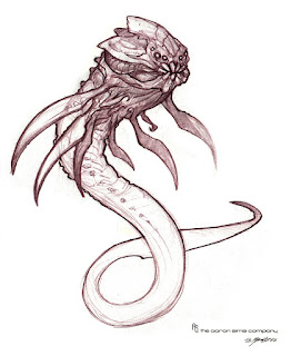
>> Part Two up Next >>
"Jerad points out in his resume multiple features that never saw the light of day. Some of which include: Monstersquad, Fantastic Four (Re-Launch), Dune, God of War, Dark Samurai and Creature from the Black Lagoon to name a few."
You'll sometimes have the option to feature the work produced for the project and to include the credit in your resume but your designs and effort will sometimes feel as if it were all for nothing.
At the end of the day, as a designer you need to realize that it's your creativity, your determination, inspiration, motivation and the experience as well as improvement that count more than anything else. If you drew what you perceived to be your best design ever and lost the file or the drawing was ripped up, you need to chock it up as a learning experience and you can only do better next time. - Mike C -
Guest blogger Mike Corriero is a character, creature, and conceptual designer and illustrator living in New Jersey. Since graduating from Pratt Institute in 2003, Mike's client list has included Breakaway Games, Fantasy Flight Games, Allied Studios, Kingsisle Entertainment, Radical entertainment/ Vivendi Universal Games, Liquid Development, Zynga Inc, Challenge Games, Paizo Publishing and Hasbro Inc, among others. Mike's book "PLANET to PLANET creatures and strange worlds" includes hundreds of his sketches of creatures, robots, alien life forms and their environments. I recommend it for students focusing on visual development for games, or anyone who loves creature design. - J. G. O.


