Sunday, October 31, 2010

A study in anthropomorphism: Disney's "Robin Hood"

Anthropomorphism is defined as the attribution of human characteristics to animals or non-living things, phenomena, material states and objects or abstract concepts. Examples include animals and plants and forces of nature such as winds, rain or the sun depicted as creatures with human motivations, and/or the abilities to reason and converse. The term derives from the combination of the Greek ἄνθρωπος (ánthrōpos), "human" and μορφή (morphē), "shape" or "form". With such a broad definition one realizes that anthropomorphism covers characters as diverse as Osmosis Jones, Mickey Mouse, HammBagheera, Draco the dragon, and the Pixar luxo lamps. All are anthropomorphic characters, but in animation when one mentions an "anthropomorphic character", they usually mean a very specific type of animal character design. And more often than not the first one that pops into most animator's minds is Disney's Robin Hood.

 
While I can't state definitively why Robin Hood in particular is seen by so many as the quintessential anthropomorphic character,  I can say that he is a classic case of form following function in animated character design.

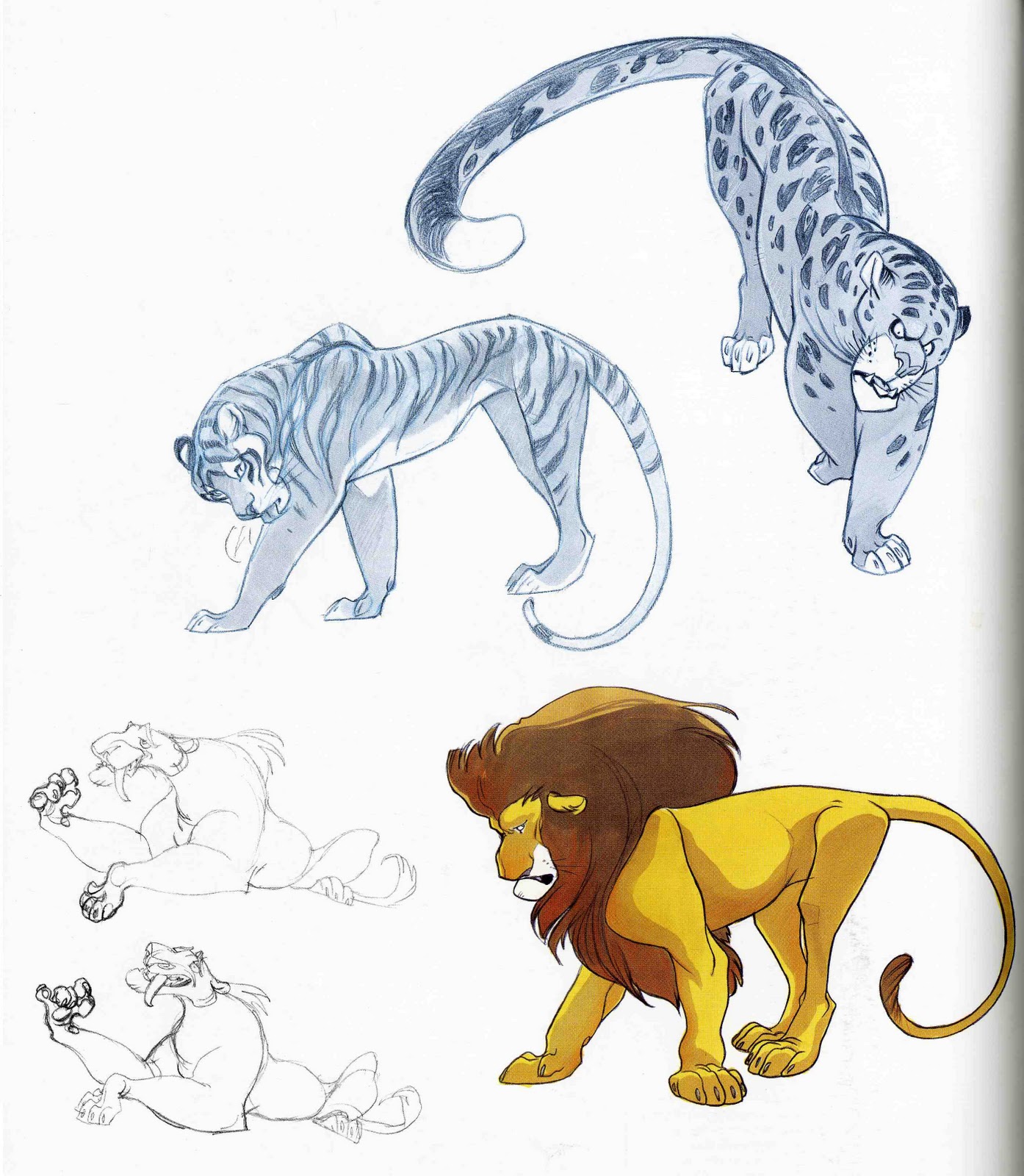
The studio chose to tell the "Robin Hood" story with animals. A fox, known for being a clever, attractive, and thieving animal, was the natural choice for the title roll. But there's one obvious problem with animating a more natural fox (such as Bagheera, who was a very natural panther); he has to draw a bow.


This becomes quite a trick for a natural fox. His shoulder blades rest on his sides, not across his back, which won't allow him to comfortably rotate his elbow up to eye level while keeping his "forearm" (front leg) straight and horizontal. Comparative anatomy between dog and human skeletons shows us that this is just the beginning of a natural fox's troubles with the role:

His humerus is too short to allow him to draw the bowstring all the way back to the level of his ear, he has no opposable thumbs to allow him to grasp the bow in the first place, and his toes are likely too short to hold an arrow to the string. Plus, standing on what amounts to his tiptoes to do all of this becomes rather awkward.

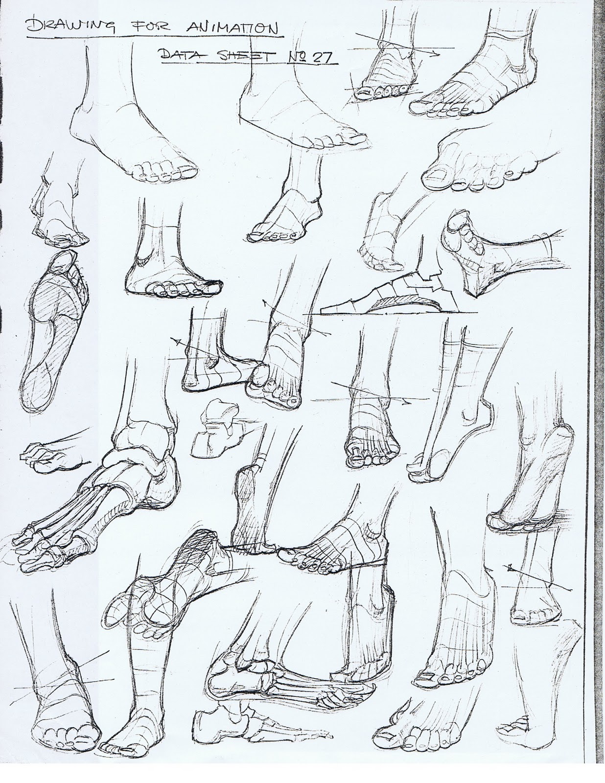
Famed Warner Brother's animator Chuck Jones had a simple formula for turning the hind legs of animals into easily animated human-like feet for anthropomorphic animals:


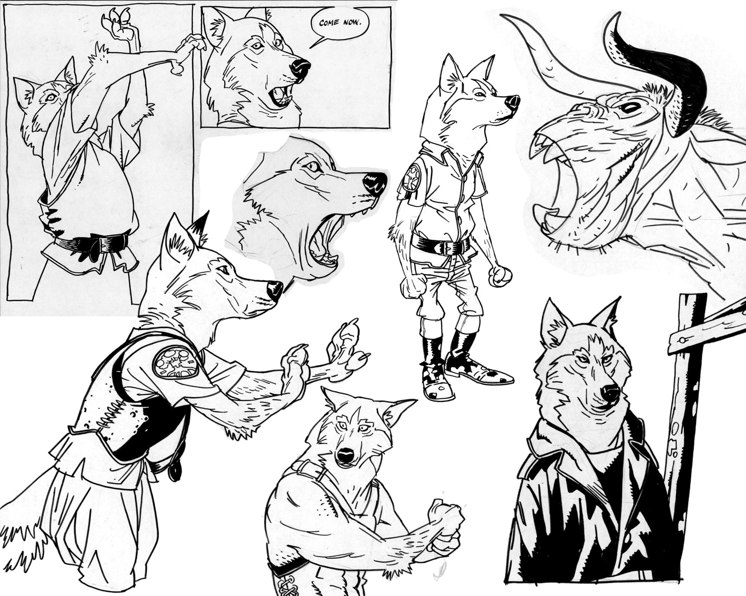
Anything covered by the shoe became the foot, while the sock covers the ankle and calf. This is exactly how Robin Hood's hind feet were redesigned. The rest followed in much the same way; The humerus and toes made it halfway to human proportions, and his shoulder blades now rest across his back. In fact, the earlier Robin Hood designs left even more of the natural fox behind in favor of a more cartoony look:


 But form followed function again; Robin had to have a few serious moments in the story, so a slightly more "realistic" and less comedic design was chosen:


Though he's still far from being a natural fox in design. In fact, remove the clothing and have him stand on all fours and the design gets a bit weird:


Disney's Robin Hood is clearly meant to be bipedal. Most quadrupeds turned into bipedal anthropomorphic designs either employ the Chuck Jones design method when rendering the hind legs or, as in the case of many rodents and ungulates, they end up keeping their natural legs and often walking on their "tip-toes". When human legs are substituted it can end up looking either like a person wearing a costume or just something that's a bit freaky, as is shown by Rune Bennicke's delightfully odd "weird wolves":


In the end Disney's Robin Hood in a mix of mostly traditional animated fox with enough human anatomy to get through many of the same challenges that Erroll Flynn had to, including drawing that bow. You'll also notice that the muzzle of the character in the final film version gets slightly shorter over time than that in "model sheet #5". This is because animating dialog tends to be a bit easier on a shorter snout (Draco also had a comparatively short muzzle for a dragon):


As always; allow your character's design to follow the functions they must perform in the story. Doing so makes an animator's job much, much easier!


Wednesday, October 27, 2010

Claire Wendling's Cats

"Wendling, Wendling! That's all I hear! And for good reason; look at her draw!"- Peter de Sêve


Born in 1967, this celebrated French artist graduated from the Beaux-Arts d'Angouleme in 1989. Later she won the prize "Alph'Art future" at the Festival of Angoulême. Wendling then joined Editions Delcourt participating in two anthologies, The Children of the Nile and Entrechats . In 1990, Claire Wendling began her first graphic novel series "lights of Amalou", written by Christopher Gibelin.
In 1997 she was hired by Warner Brothers and emigrated to Los Angeles to participate in various projects. Frustrated by the creative constraints of the studio , she returned eight months later to France to continue her career in graphic novels, game design and illustration. Her work is the subject of the rare and sought after art books "Desk", "Iguana Bay", "Drawers", and most recently "Daisies". All I highly recommend; they are available through Amazon.fr, Amazon.ca, Stuart Ng  and Gallery Nucleus

Years ago when I was struggling with an illustration of a lion I asked veteran lead  Disney Animator Ruben Aquino for advice in creating more believable lion anatomy. "Do you have any cats at home?" asked adult Simba's animator. I did. He added "Then that's all you need. It's the same anatomy and behavior; study your own cats, and you'll get the answers that you're looking for." Similarly, Claire Wendling's observations of her own cats have paid off in huge dividends and prove Ruben's point well. Her affection for her subjects is quite evident. When looking at her drawings of felines both large and small, one can imagine that the following illustration is semi-autobiographical:
It all starts with life drawing. As we study animal design in this week's module, take some time to sketch your own pets or those of a friend. If you don't have any handy nearby, try a pet store or animal shelter (go to www.petfinder.com to find those in your area). Those in bigger metropolitan areas may also have access to zoos and wild animal sanctuaries. Wendling's cat life studies can supply some inspiration. Don't stick with static poses alone; catch them in action, include sketches showing typical emotions and behaviors:


Claire Wendling's understanding of domestic feline anatomy and behaviors clearly has aided her in her drawings of bigger cats. It's obvious that she's able to "build a 3D model" in her mind that she can turn and move around into just about any pose imaginable. This is a skill that only comes from many hours of observation:


From the brutal:

To the adorable:


to the fantastic:


Without this through understanding of feline anatomy, designing successful graphic or "cartoony" designs of these animals simply isn't possible. Wendling's cowardly lion and big cat designs for animated films display her understanding of the feline form just as strongly as do the previous pencil studies. As always; study and a through understanding of real world subjects lays the foundations for great character design.


 Exercise: do your own life studies of domestic cats, then view the following video, noting the similarities in both anatomy and behavior between domestic and their wild counterparts. Then try a few video life studies of the larger felines.

Friday, October 22, 2010

Mort Drucker

Born in in New York City in 1929, Mort Drucker is is a caricaturist and comics artist best known as a decades-long contributor to the satiric magazine Mad, specializing in drawing movie satires. Drucker entered the comics field by assisting Bert Whitman on Debbie Dean in 1947. He then joined the staff of National Periodical Publications (DC Comics), where he worked as a retoucher. Early in the 1950s, Drucker began doing freelance work. (click on any of the images below to enlarge them).


In the fall of 1956, shortly after the departure of original editor Harvey Kurtzman, Drucker found his way to Mad. His debut there coincided with a World Series broadcast, and publisher Bill Gaines told Drucker that if the Brooklyn dodgers won the game, he would be hired. The Dodgers did win. Capricious though Drucker's alleged audition process may have been, it made for a good anecdote. More than a half century later, Drucker held the longest uninterrupted tenure of any Mad artist.
During the same period, Drucker pursued assignments in television animation, movie poster art and magazine illustration, including covers for Time. He remained active for DC, illustrating War Stories, among other titles. In 1962, Drucker teamed with Paul Laiken on the JFK Coloring Book for Kanrom Publishers.

Mort Drucker was recognized for his work with the National Cartoonists Society Special Features Award (1985, 1986, 1987, 1988) and its Reuben Award (1987).


Friday, October 15, 2010

Foot Reference


These wonderful pages were put together by Jim Macaulay, and animation instructor at Sheridan College in Ontario, Canada. Click on any of the above images for a larger view to print out and save as reference for future projects.


Thursday, October 14, 2010

Joshua Middleton

Eisner award nominee Joshua Middleton's career has only spanned ten years, but in that time he has worked as a highly successful artist and designer in the animation, film, comics, and publishing industries. Middleton started his career as a comic book artist in 2000 as penciler for CrossGen's Meridian. After CrossGen, he joined a small independent British publisher, Com.x, with plas to release his own series Sky Between Branches . A  preview issue debuted in early 2002, along with some other work for the publisher.


 After contributing covers and short stories to X-Men Unlimited beginning in late 2002, he signed an exclusive contract with Marvel Comics in 2003 and worked as cover artist on New Mutants and created NYX with Joe Quesada as a writer. Following his stint at Marvel he signed exclusively with DC Comics in 2004. His first DC series was Superman/Shazam: First Thunder, a miniseries that launched in September 2005. Along with illustrating some short stories and single issues, Middleton also served as regular cover artist for the Vertigo series American Virgin. and is the current regular cover artist on DC Comics' Supergirl ongoing series. While no longer under contract with DC, Middleton has continued to produce comic book art almost exclusively for the publisher.


In addition to his comic book work, Joshua Middleton has illustrated book covers for several major publishers, including Scholastic Books, Abrams, Penguin, Viking, Tor, and Disney Press. Middleton has also served as a conceptual artist/illustrator for feature films produced by Universal, Warner Brothers, Disney, Marvel Studios, Sony Pictures, and Sony Pictures Animation.


Middleton starts with small thumbnail sketches, working various concepts and idea before doing a blue line of the final image. He generally  pencils in either graphite or non-photo blue and inks traditionally with a brush and pen, often on vellum. He then does the color work in Photoshop, sometimes using Corel Painter for additional effects. Listen to his sidebar podcast interview here  and see more of Middleton's work at both his website and blog.